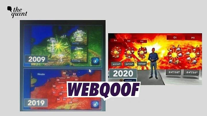
A collage of three photographs – two weather maps and one weather report – has gone viral on social media.
The first image showed temperatures on a green map from 2009, the second one showed temperatures in a similar range on a red colour map from 2019.
The third image showed a weatherman presenting the weather report while standing in front of graphic made of fireballs.
The claim along with the viral image said that television channels were purposefully changing the colour of the weather maps to create panic and exaggerate the impacts of climate change.
The claim went viral while Europe was reeling under a severe heatwave that lead to several forest fires.
However, we found that the claim was false. The first two maps showed different indicators, while the third image was edited to change the background of the report.
WHAT WE FOUND OUT
We conducted a reverse image search of the first image on Yandex search engine and found the image on a German news channel "Tagesschau" which is managed by ARD broadcasting service.
The article, which was published in 2019, carried a comparison between two the first two weather maps – one from 2009, and one from 2019.
The article was a clarification published by ARD over accusations of exaggerating the effects of climate change by manipulating the colours in the weather map. The accusations were levied by German politician Sven Tritschler.
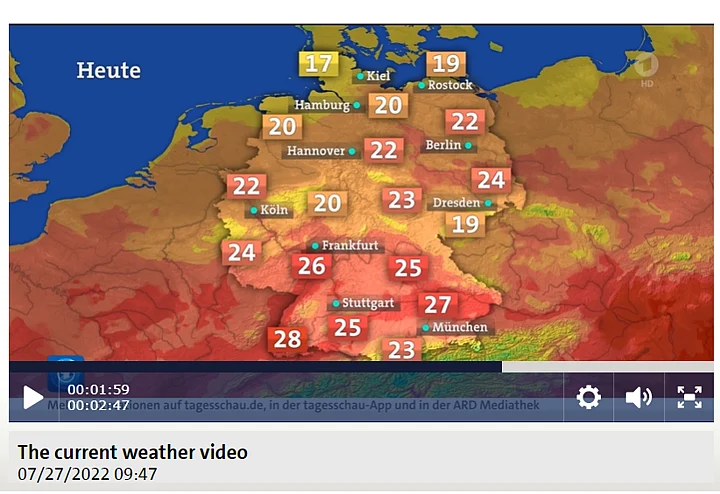
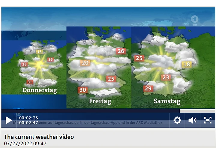
The article clarified that the two maps showed two different things and hence, it was not right to compare the two. While the first map (green) showed the weather forecast for the upcoming three days, the second (red) showed the weather predictions for the same day.
The article also had a link to the 2009 weather report that showed that the next day's weather predictions indeed had a different colour scheme based on the temperatures.
We also checked the most recent weather report available on Tagesschau and noticed that the channel still uses a green colour map to show predictions for the next three days and a different map to show the weather report for the day.
(Swipe to see both the images.)
WHAT ABOUT THE THIRD IMAGE?
When we conducted a reverse image search on the third image, we found a 2019 tweet with the image.
However, the image in the tweet showed a different background than the one seen in the viral photo.
While the original photo had the image of sunset in the background, the viral image showed fireballs and even the face of the host had been altered and turned red. Moreover, the claim that the weather report was from 2020 was also wrong.
We also noticed the name of the news channel written on the top-left corner of the original image – RTL. We conducted a keyword search for RTL and weather report and found a fact-check report published by a German fact-checking organisation Correctiv in 2021.
The altered image was viral in 2021 as well and Correctiv reached out to RTL for statement.
The meteorologist presenting the show, Christian Häckl, told the fact-checking organisation that image with a sunset background (found on Twitter) was from the actual broadcast but that too had colours boosted. He shared the original footage of the broadcast that showed that the background image was different.
Evidently, a collage of two unrelated weather maps and a doctored photograph was shared by several people on Twitter to claim that news organisations were manipulating weather maps to spread panic about climate change.
Similar claims were also made about the BBC and the UK meteorological department recently to claim that the colour scheme was changed to create panic among people.
Reuters fact-check contacted the BBC and the UK meteorological department and they informed the news agency that the colour scheme was changed to make the maps more accessible for viewers with colour blindness.
(Not convinced of a post or information you came across online and want it verified? Send us the details on WhatsApp at 9643651818, or e-mail it to us at webqoof@thequint.com and we'll fact-check it for you. You can also read all our fact-checked stories here)


