This Cool Animated Global Carbon Map Can Add to Your Perspective
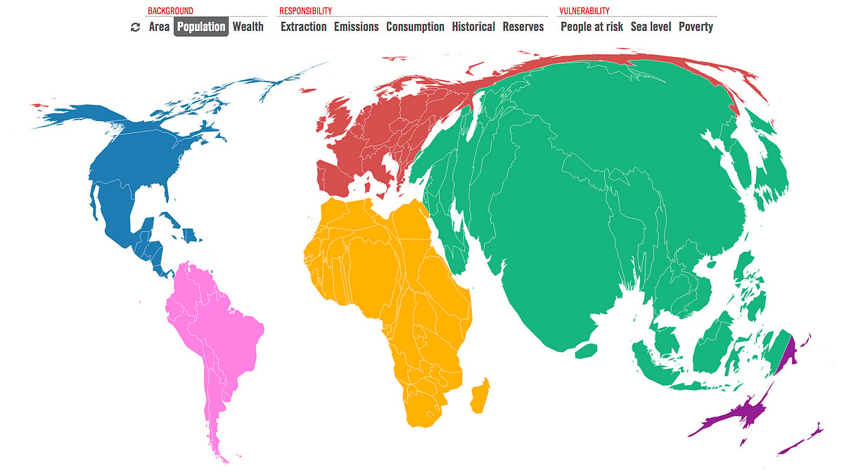
This interactive, animated map allows us to find out which nation and continent contributes the most to emissions.
advertisement
There’s a big climate change debate going on in Paris and a map can help you make sense of who stands where.
Bitterly divided negotiators from nearly 150 countries began talks on November 30 on a landmark deal to cut Earth-warming greenhouse gas, amid rising emissions and 2015 threatening to be the hottest year ever recorded in history.
The talks started a day after the heads of over 150 nations, including Prime Minister Narendara Modi, gathered in a bid to provide a political push for a powerful climate deal.
The 12-day conference hopes to achieve a legally binding and universal agreement on climate, for the first time in over 20 years of UN negotiations, with the goal of keeping global warming below 2°C over pre-industrial temperatures.
An interactive, in-depth map allows us to find out which nation and continent contributes the most to emissions, as well as the correlation between wealth, population, consumption and emissions.
Kiln, a partnership of Guardian writer Duncan Clark and developer Robin Houston, has come up with this new animated take on the globe.
Check the map out here.